Brief:
Redesigning the IRCTC website Homepage to create a seamless, intuitive, and consistent booking experience for diverse users across India.
Problem Statement:
The current IRCTC website overwhelms users with cluttered layouts, inconsistent navigation, and vague error messaging — resulting in frustration and inefficient booking experiences.
Research:
Through heuristic evaluation and user journey analysis, major usability issues were identified-
Heuristic Evaluation:
Strength | Flaws |
|---|---|
Loading indicators are present during ticket searches. | Unclear error messages when the system is down or tickets aren’t available. |
Terms like “Tickets,” “Trains,” and “PNR Status” align with real-world concepts. | Use of technical jargon like “Tatkal” and unclear terms for non-regular users. |
Users can log out or cancel a booking process. | No clear “back” option in the middle of booking; users need to restart if they make a mistake. |
Common terms like “Login” and “Sign up” are consistent. | Inconsistent placement of elements (e.g., the menu and search options change across pages). |
Error messages do appear when input is wrong. | Messages are often vague (e.g., “Something went wrong”), lacking clear instruction for resolution. |
Navigation is straightforward on the homepage. | Options like “Passenger List” are hidden deep within the site, forcing users to recall where they last found the information. |
Frequent users have quick access to ticketing. | No keyboard shortcuts or advanced search for expert users. |
Some pages have minimalist designs. | Overwhelming amount of information and ads on the homepage, causing confusion. |
Help section is available. | Instructions are complex and not easily searchable; the FAQ section lacks clarity. |
Overview:
Vague Error Messages: Many error messages like “Something went wrong” do not provide enough guidance for users to correct the issue.
Inconsistent Navigation: Different pages have inconsistent layouts, causing users to reorient themselves constantly.
Overloaded Homepage: The homepage contains excessive ads and options, overwhelming users and affecting task efficiency.
Hidden Features: Important features like “Passenger List” and “Booking History” are hard to find, reducing the usability of the site.
Limited Undo and Back Functionality: Users cannot easily navigate back or undo steps when making mistakes during the booking process.
User Pain points:
Inconsistent Navigation: Layouts and menus vary across pages, causing confusion and extra effort.
Cluttered Homepage: Too many ads and options distract from key actions like booking tickets.
Vague Error Messages: Generic alerts like “Something went wrong” leave users without guidance.
Hidden Features: Important tools like Booking History are buried in deep menus.
No Back/Undo Option: Users must restart if they make mistakes during booking.
Complex Terms: Railway jargon confuses occasional users.
Poor Visual Hierarchy: Key actions lack clarity due to inconsistent spacing and emphasis.
Opportunity:
To redesign IRCTC’s digital experience by-
Streamlining navigation and ensuring design consistency across pages.
Simplifying the homepage to focus on primary user goals (ticketing & status).
Crafting clear, actionable feedback systems for errors and confirmations.
Enhancing accessibility by surfacing key features intuitively.
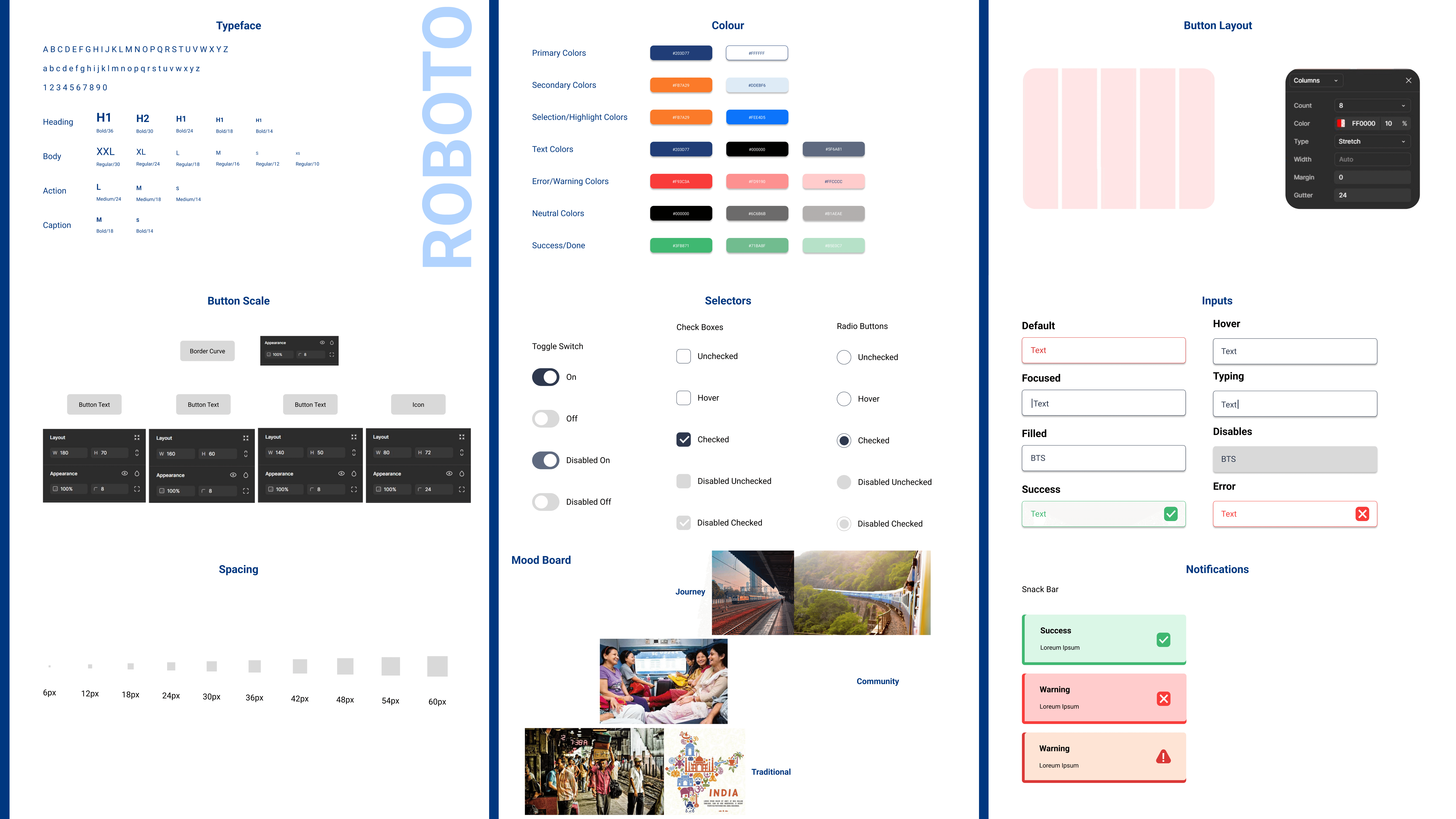
Design System:

Redesigned Homepage:


